Realme Unveils Its New “Realme Yellow” Logo Today
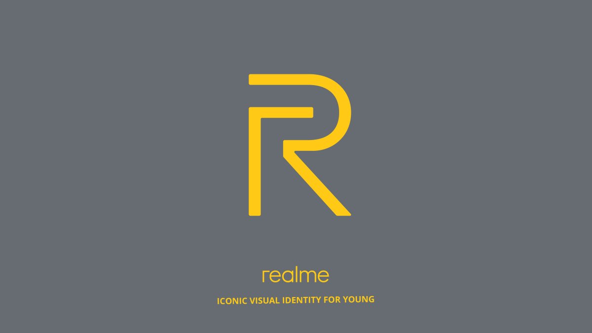
From being an OPPO’s Sub-Brand and then forming its own company, The new Realme yellow Logo has been revealed to upgrade its Brand Visual Identity. Realme Yellow; the brand new logo is designed by Eddie Opara, partner and chief designer at design consultancy Pentagram.

The new logo was unveiled through a tweet which said, ‘It’s not just a new logo! It’s a new us, an iconic visual identity designed for the young!’. Targeting the youth population across the world the Realme Yellow represents power, style, modernity, and youthfulness.
Realme Decide To Change Red For Yellow In Its New Logo and Identity

As a sub-brand of OPPO, the previous Realme logo had a red in color. The brand name was written in black and white as shown in the image.
Design Of Realme Yellow Logo
The New Realme Yellow logo is designed in a way that it consists of Capital(Uppercase) ‘R’ and small(Lowercase) ‘r’. The Uppercase ‘R’ represents original aspiration of Realme in providing the youth with quality products they need and the lowercase ‘r’ signifies young people’s true selves.
Plans As A New Brand-
Realme has planned to launch across Southeast Asian markets including Malaysia, Thailand, Philippines, Cambodia, countries in South Asia, the Middle East and North Africa very soon.
As stated by Realme’s CEO Sky Li; Realme is planning to introduce new products with unique and stylish design paired up with powerful performance.
Remarkable Journey Of Realme –
Being a young brand (established in May 2018), Realme has witnessed a remarkable journey. It has grown rapidly and cemented its position for the Brand.
We believe that the new logo will be a major tool in connecting with the youth going forward,” said Madhav Sheth, CEO, Realme India.
It will be interesting to see if there is any change in the company’s strategy of selling mobile phones now that they’ve adopted a new brand identity.


